
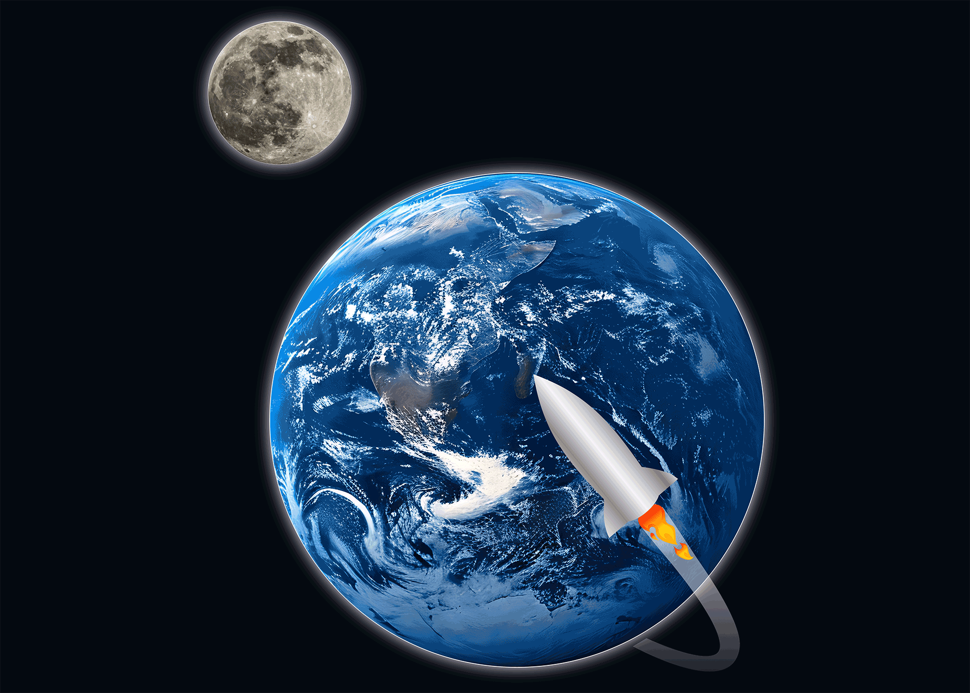
Planet Delivery
Concept Brand Identity
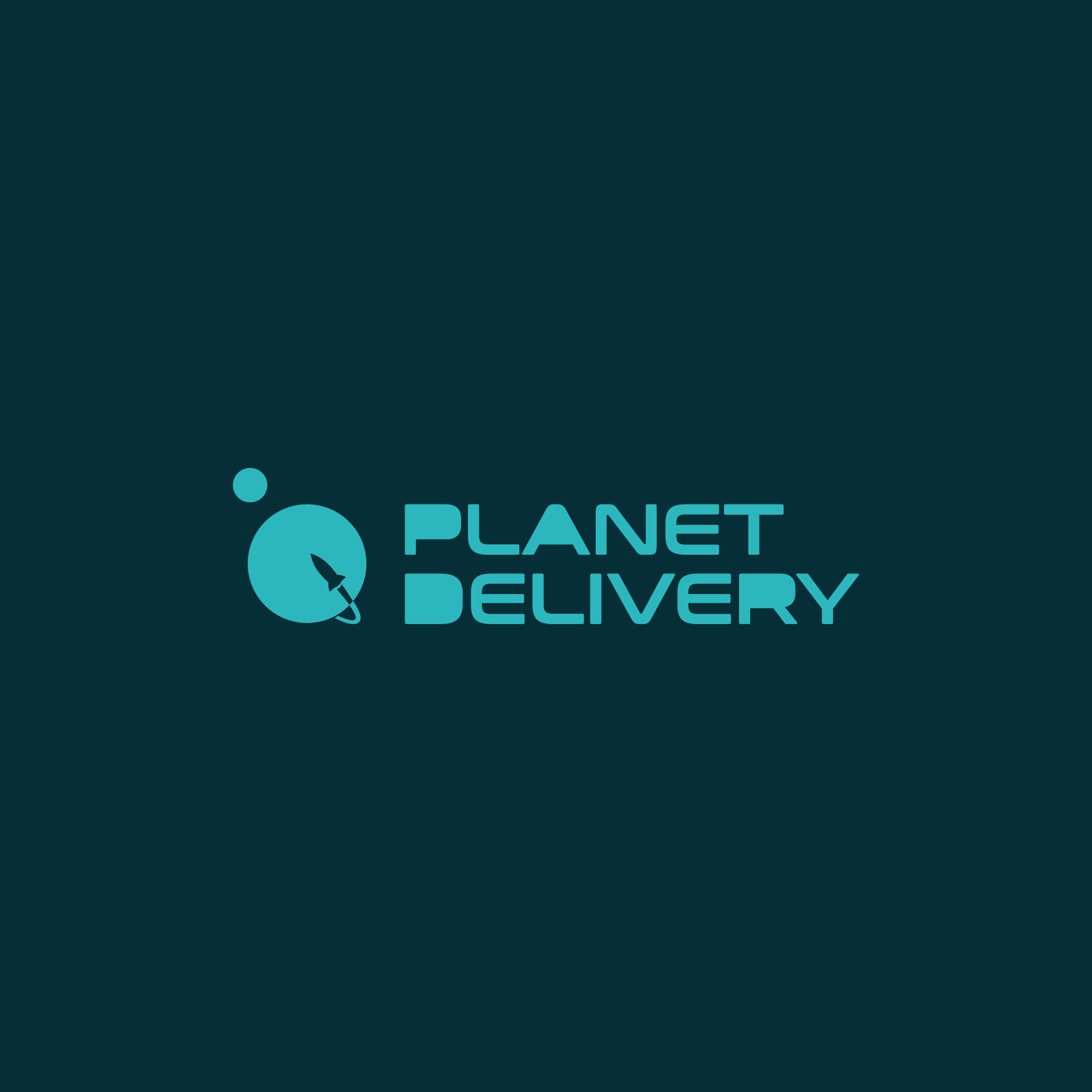
Planet Delivery is a conceptual brand identity developed to explore visual systems for modern logistics and delivery services. The goal was to create a minimal, scalable mark that communicates movement, reliability, and global reach.
The identity centers on a planetary form intersected by an orbital path, symbolizing the continuous flow of goods and the interconnected nature of delivery networks. The geometry is kept clean and balanced, allowing the mark to remain highly recognizable across digital platforms, packaging, and transportation applications.
The result is a simple, adaptable identity system that conveys efficiency and motion while maintaining clarity at various scales, positioning the concept as a flexible foundation for contemporary delivery branding.

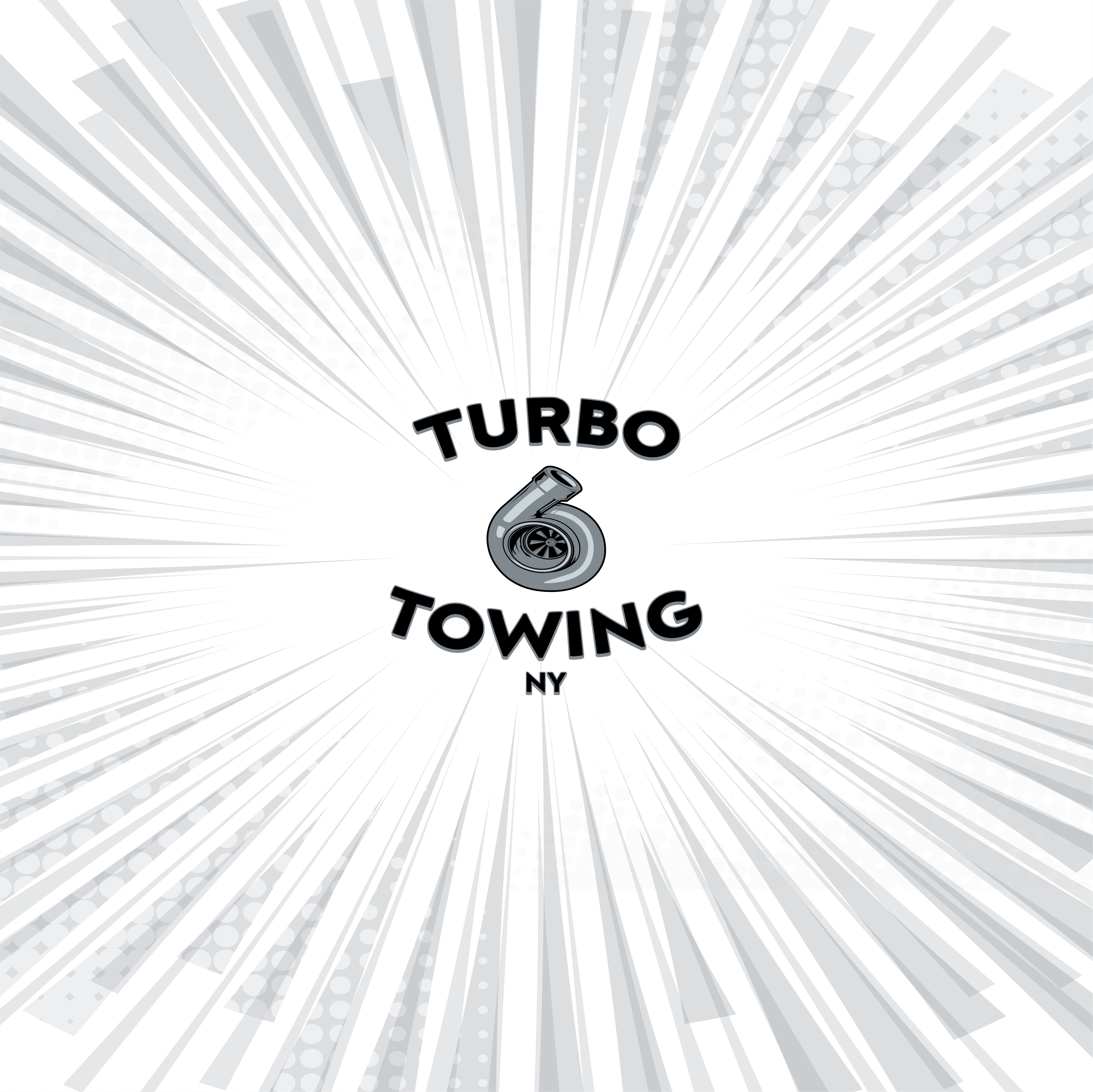
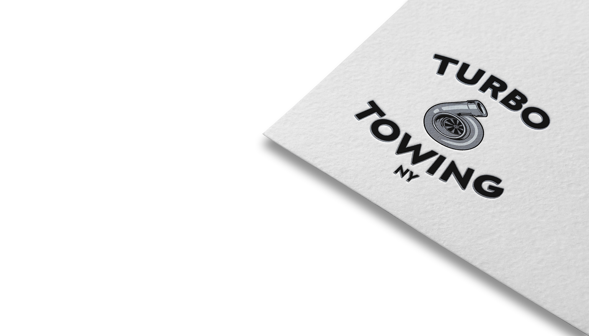
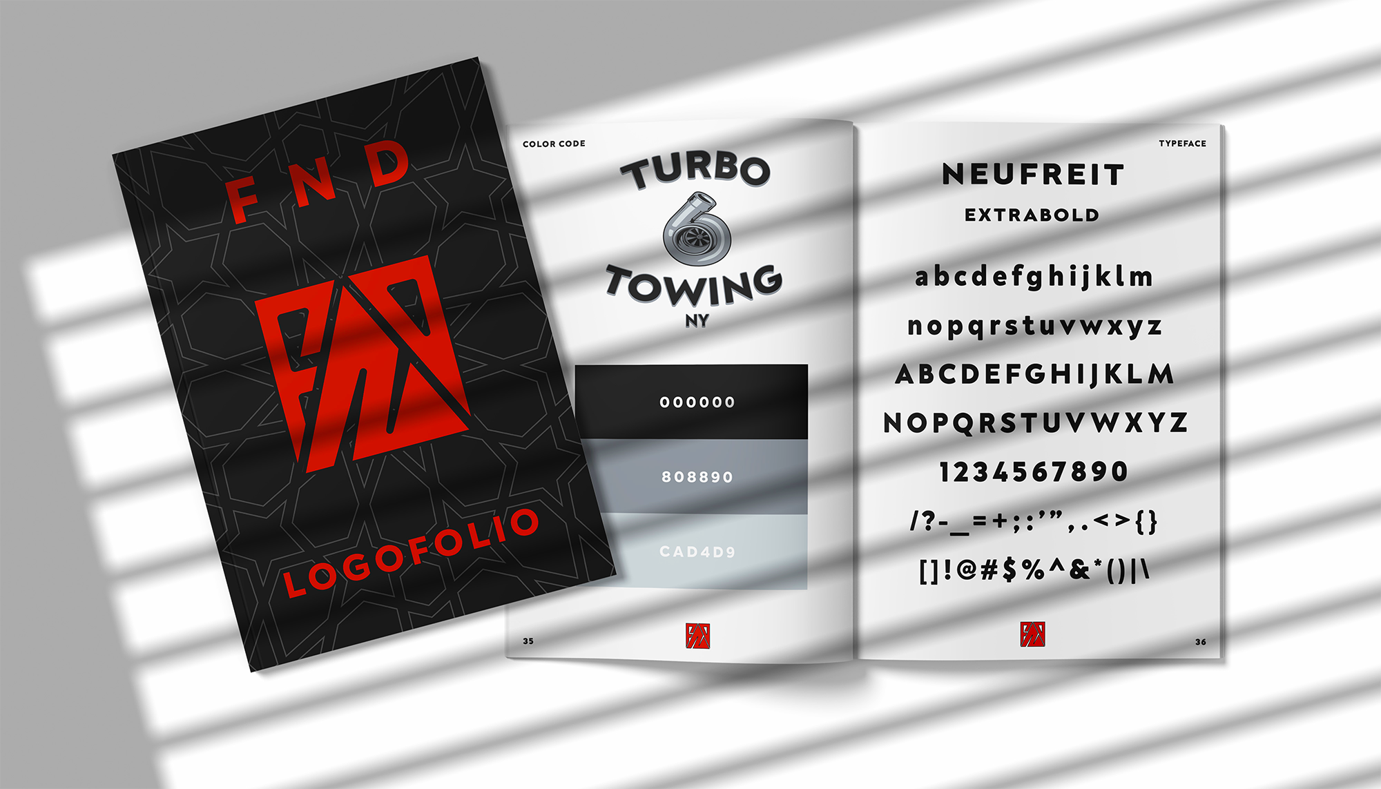
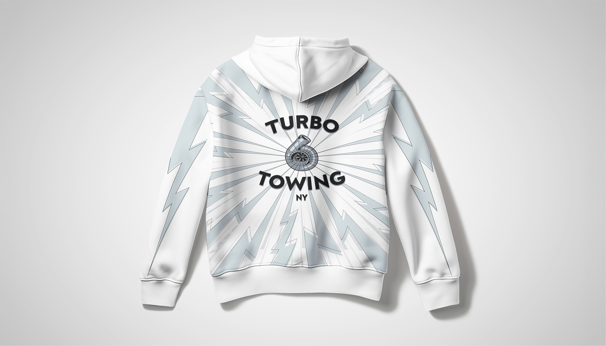
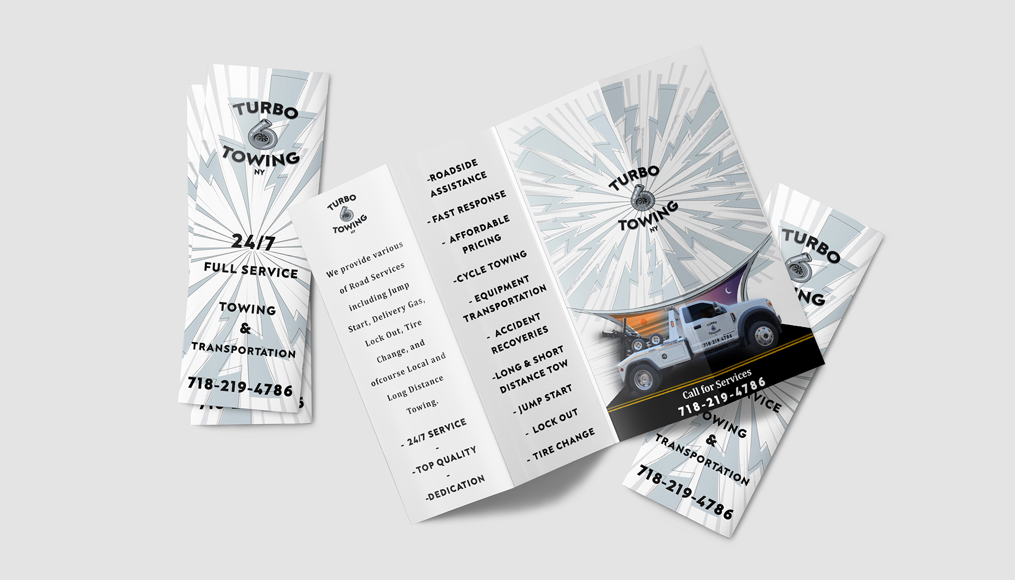
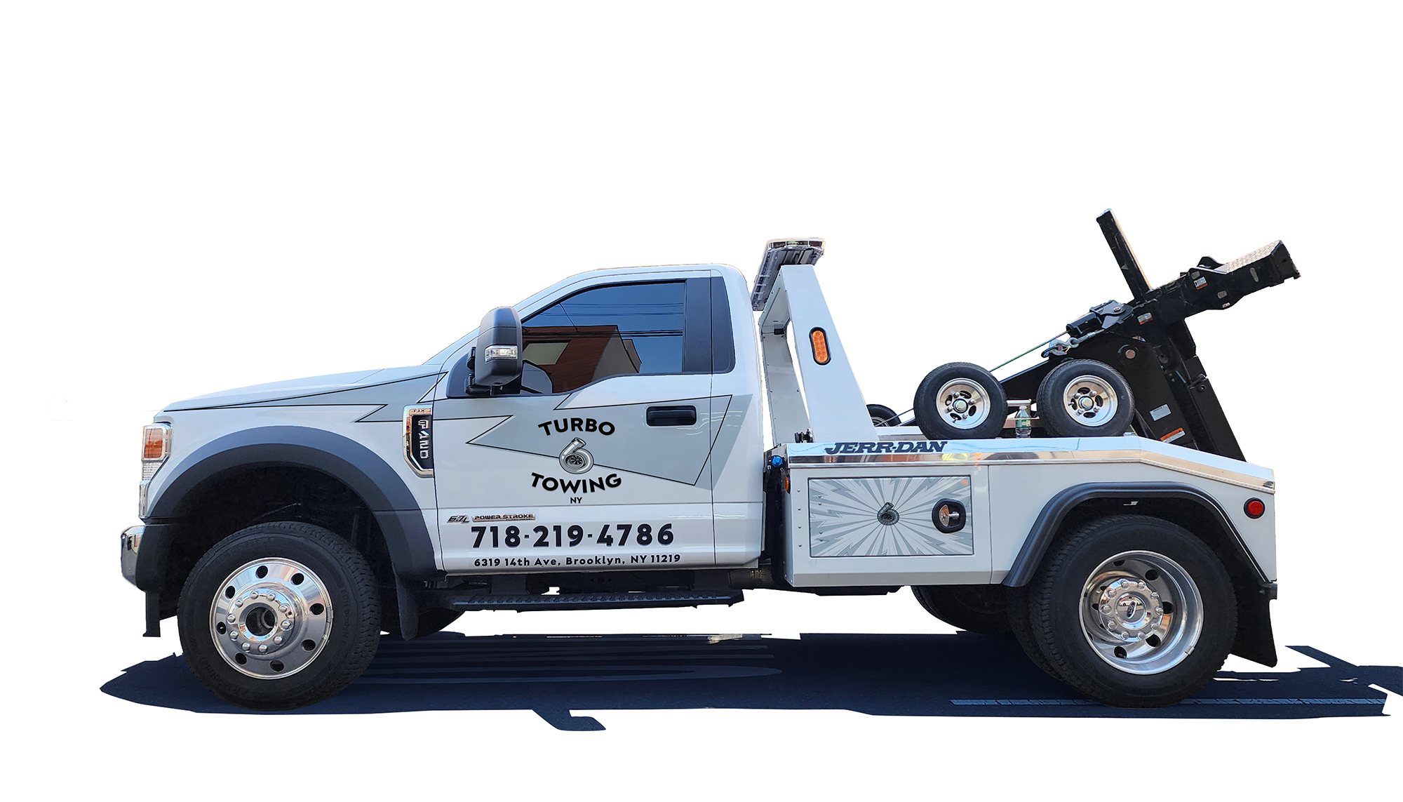
Turbo Towing
Brand Identity • Logo Design
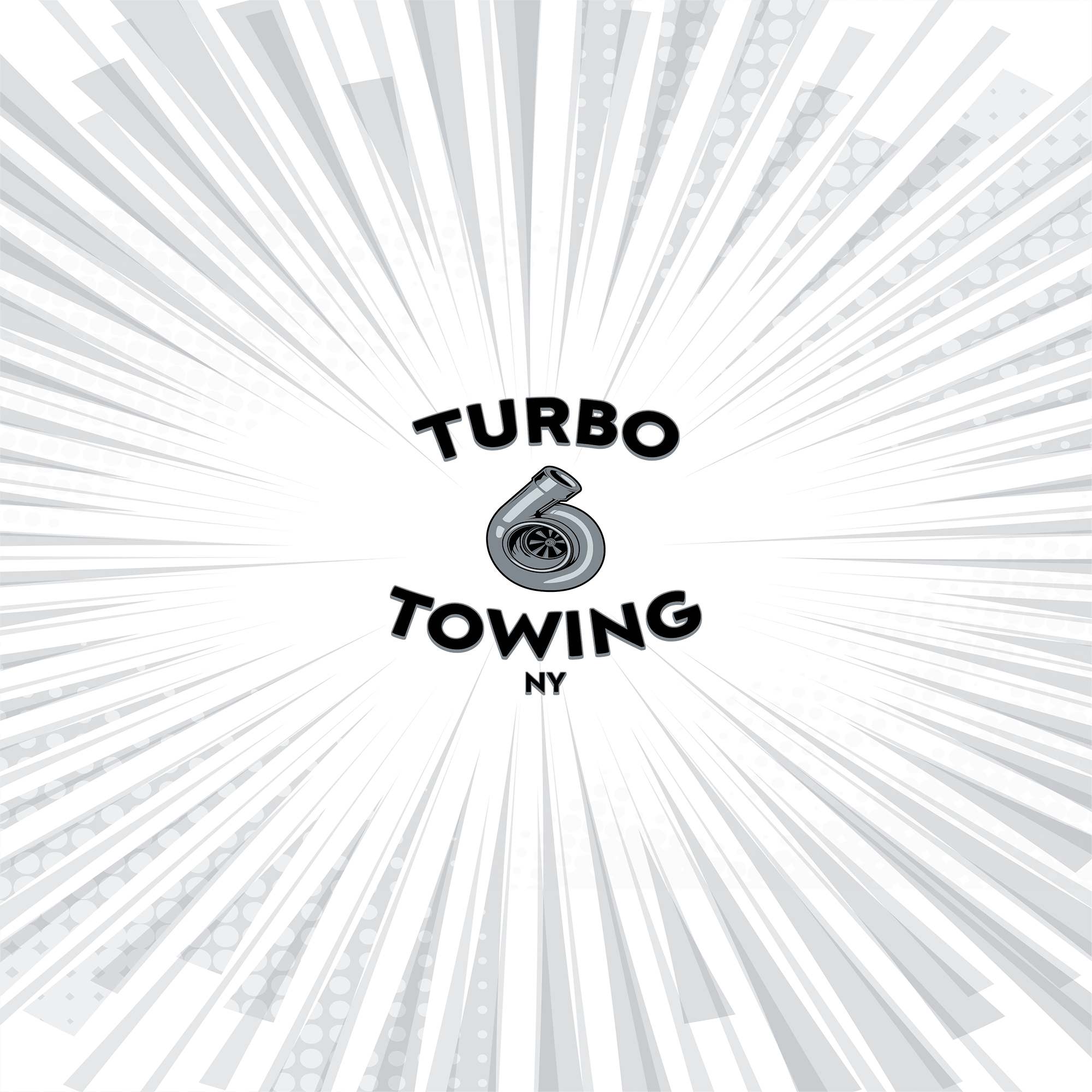
Turbo Towing was developed as a bold, heritage-driven identity rooted in the visual language of automotive and motorcycle club culture. The goal was to create a recognizable mark that reflects the brand’s connection to towing, performance, and the communities surrounding them.
The design centers around a turbo illustration, symbolizing power, speed, and mechanical precision. Rendered with controlled contrast and subtle tonal depth, the mark reinforces the technical and performance-oriented nature of the service. The typography follows a classic rocker-style format, referencing traditional motor club insignias while maintaining clarity and strong visual structure.
The final composition balances bold typography with a structured emblem, creating an identity that feels both authentic and durable. The result positions Turbo Towing as a reliable, community-rooted service with a strong presence across vehicles, uniforms, and roadside applications.
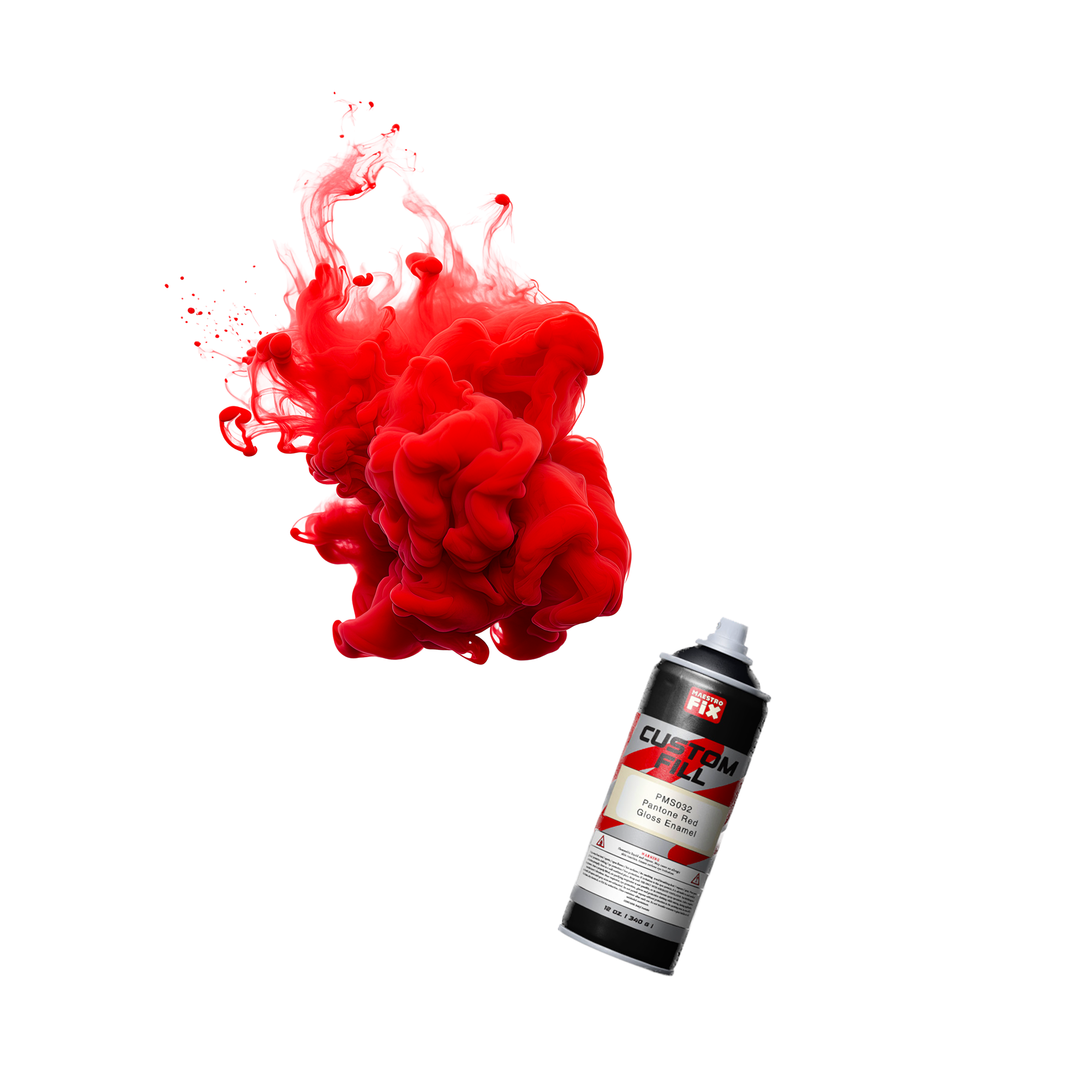
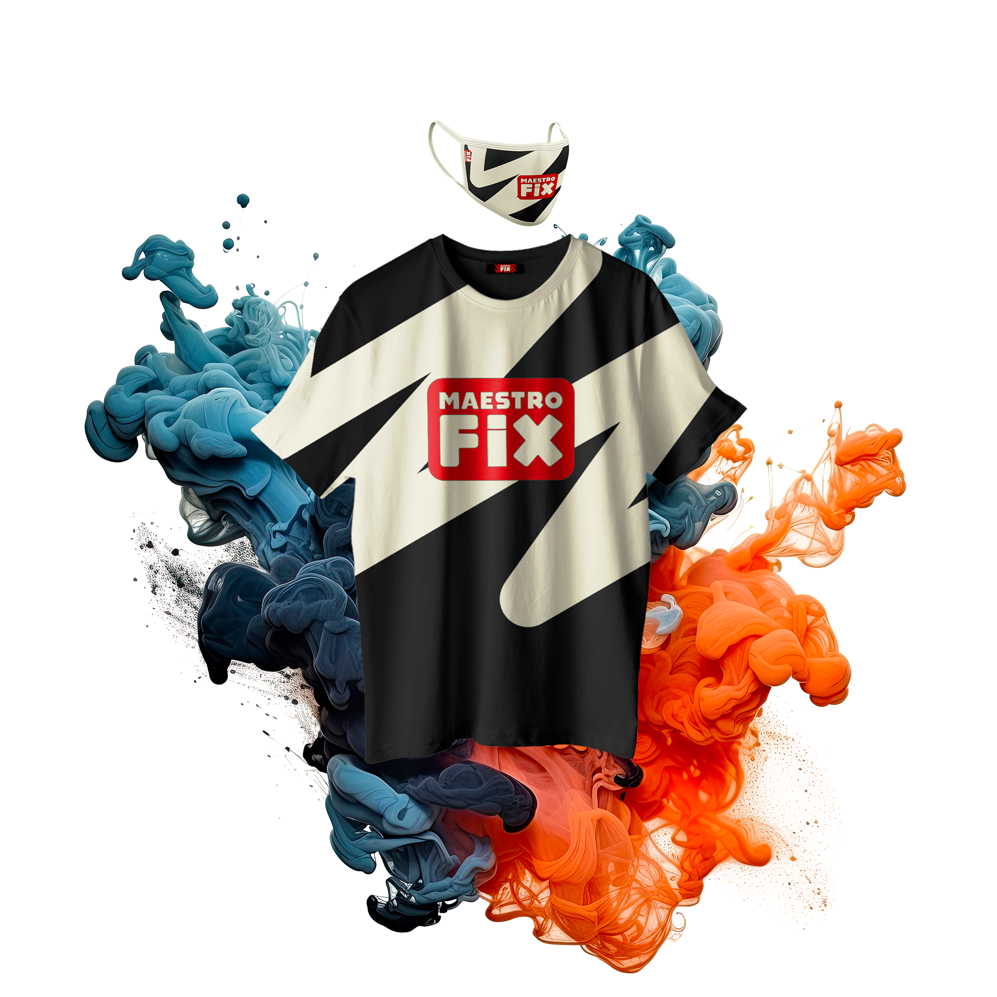
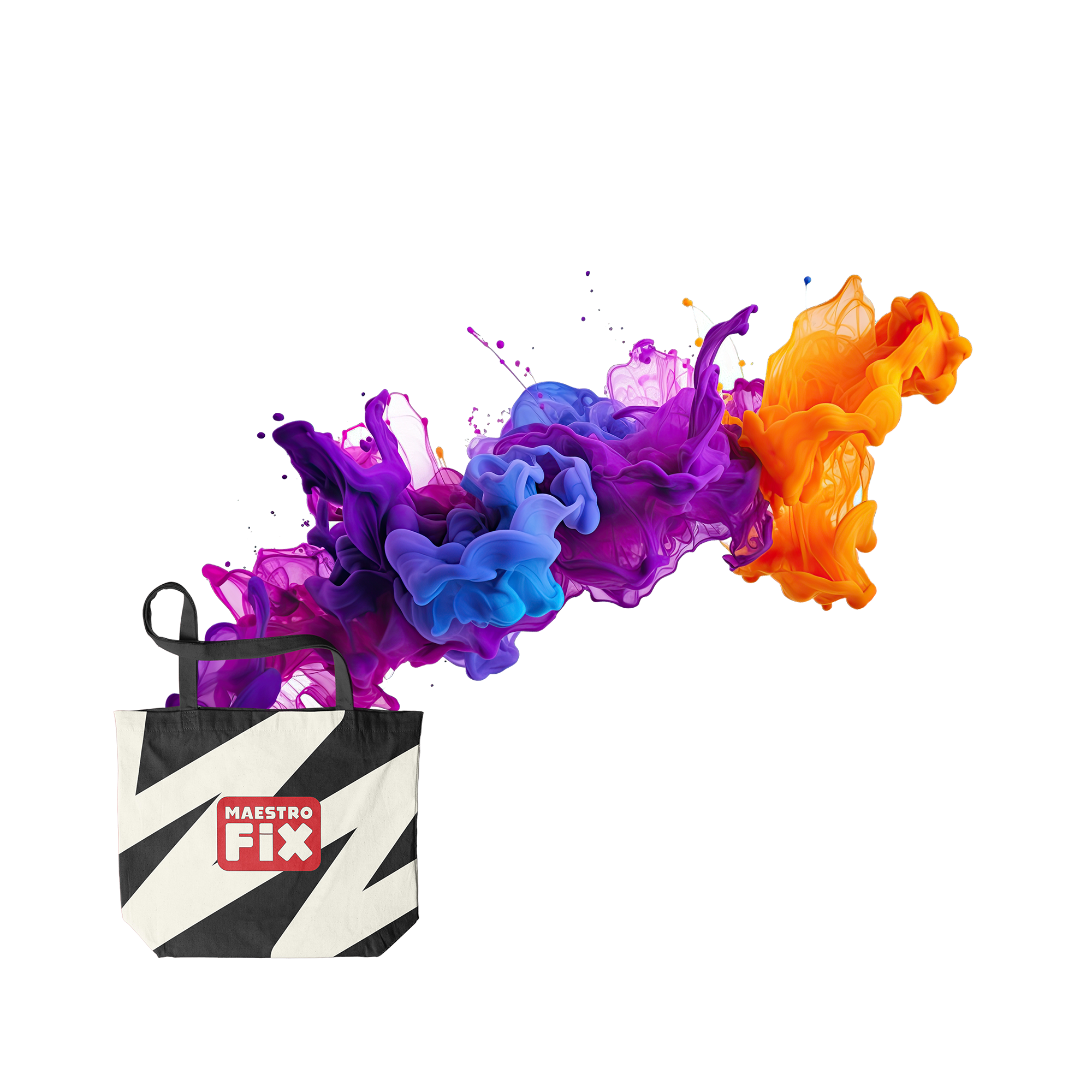
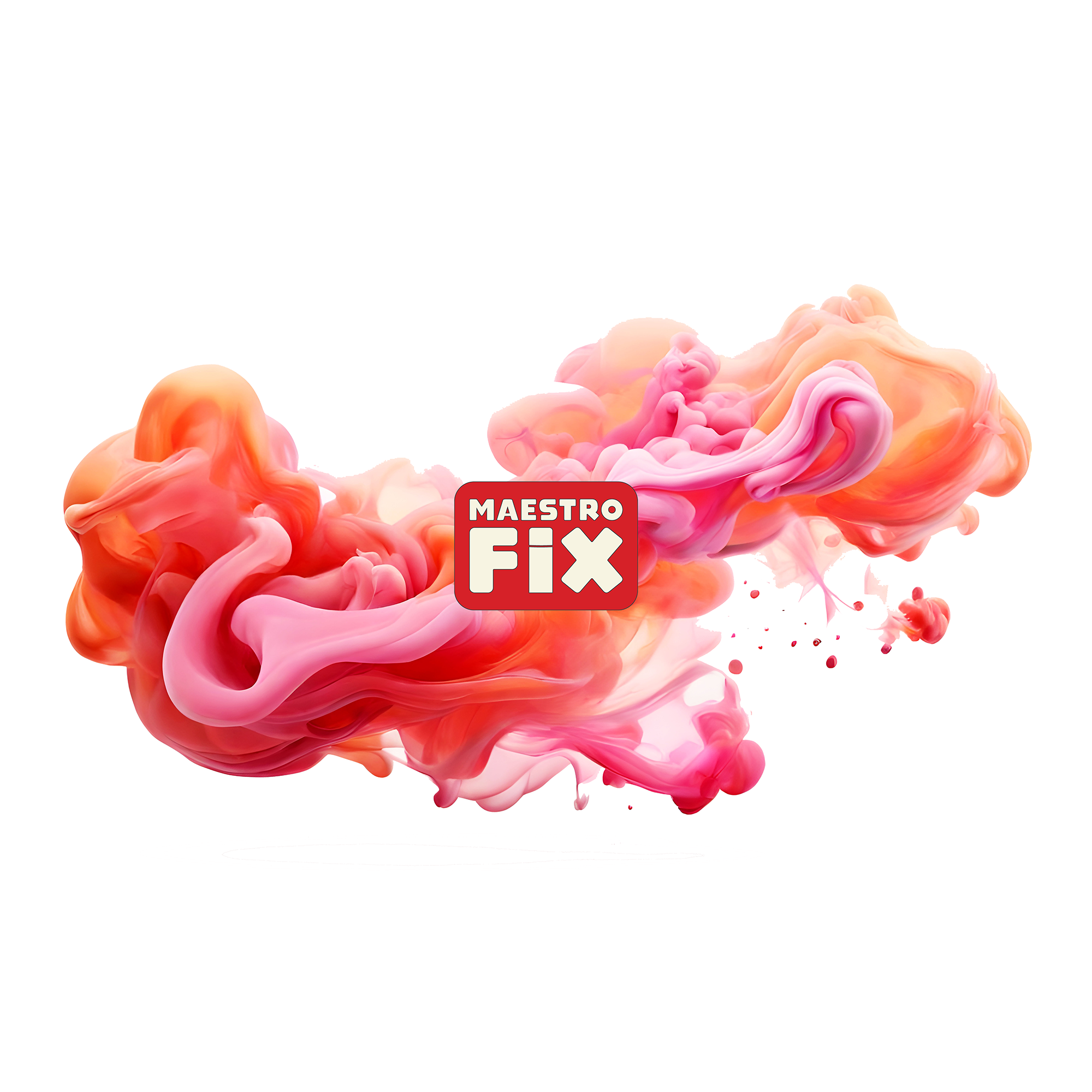
MaestroFIX
Brand Identity • Logo Design
MaestroFIX is built around a bold, highly legible wordmark designed for strong visibility across spray can applications. The composition emphasizes the word “FIX,” reinforcing the brand’s role as a direct, reliable solution for paint correction and touch-ups.
A key feature of the identity is the custom “I” within FIX, which functions as a hidden spray can. Derived from the Toybox letterform, the character is modified to read as both a lowercase “i” and a capped spray can, subtly embedding the product into the logo itself. This detail adds a layer of visual meaning while maintaining clarity at small scale.
The mark is set within a high-contrast red field with a neutral typographic treatment and black outline, ensuring strong legibility across packaging and varied surfaces. The result is a clean, functional identity that balances industrial precision with immediate visual recognition.